2007-04-30

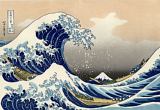
Language as folk craft

I found an interesting language-related analogy in YANAGI Sōetsu's classic 1933 essay "Whither folk crafts?" (柳宗悦, 民芸の趣旨, Mingei no shushi*):

Folk crafts, by definition, do not bear signatures. ... Consider: Japanese people who don't even know what grammar is can use complicated Japanese without difficulty. How different this is from speaking a foreign language, when we must awkwardly consider each point of grammar as we speak! When the words begin to come with ease, our use of the language is at its most unremarkable (平凡). Put another way, we can only use a language freely if we can use it in an unremarkable fashion. Folk arts must share this quality of being easily accessible to anyone. The "remarkable way" (非凡の道) of the inspired genius is not the way of folk crafts.

Folk crafts in Yanagi's definition are for use, not display, and they are judged solely on how well they meet the needs of the user. (These needs are defined so that we do not have to deal with edge cases, like impractical and expensive art that nevertheless meets the not uncommon psychological need to appear both rich and cultured, or cheap mass-produced crap that addresses the needs of underpaid urban laborers who can't invest in generation-spanning quality.)

In this scenario, good design evolves over centuries under the practical pressures of everyday life. Philosophers, theoreticians and capital-R Romantic artists might achieve wonders in their own fields, but this is irrelevant to folk art unless and until the folk crafters recognize in these achievements a solution to some specific design problem their users face.

The main difference between folk crafts and language, then, is that there are fewer people going around insisting that cups without handles are ugly, or writing op-eds about the kids today and their loutish, insolent non-wicker chairs.

* Literally, something like "Goals for folk crafts", but given that it was published in 1933, I feel that "whither" is more idiomatic. (Back)

2007-04-27

Ise, schmise

My post in February about online scans of the Ise monogatari led to Brian's detailed post about mana as well as a great MetaFilter thread courtesy of Languagehat.


LOL pointy boats

Minor MeFi drama broke out when someone accused us of using the pictures in the books as the raw material for cheap gags instead of respecting them for their place in art history &c. &c. To see my sinister plot so perilously near discovery terrified me, and I had already shredded half of my records when Mr Hat and his shadowy allies reappeared to distract the whistleblower with oily sophistry about respecting and mocking the art at the same time. I was safe -- but everyone knows that Mr Hat's assistance always has a price...

Seriously, enjoying art from different perspectives is not a new phenomenon, nor one exclusive to cultural outsiders. The Ise monogatari itself has been revered and ridiculed in equal measure for centuries, and the glorious exemplar of that tradition is also available at Waseda: the Nise monogatari (仁勢物語), freely romanizable as Tales of Schmise.*.

The Tales of Schmise, written in the mid-1600s by an unknown author (traditionally KARASUMARU Mitsuhiro, but modern scholarship says probably not), is a parody of the Tales of Ise as meticulous as it is juvenile. Every chapter in Ise has a corresponding chapter in Schmise which follows it in structure and sound as closely as possible while cruelly warping all the details.

Greedy slobs replace sensitive gallants, beautiful maidens become withered crones, and all the vignettes revolve around food, cowardice, farting, skin disease, or some other charming topic. Equivalents in the modern Anglosphere might include Mad magazine's scene-by-scene movie parodies (I was tempted to translate the title Tales of I-blecchh!), or that sub-genre of cinema wherein self-aware comic dialogue is dubbed over corny old movies.

For example, here's the 2nd chapter of Ise (with modernized pronunciation, etc.), with quick-and-literal translation:

Mukashi, otoko arikeri. Nara no kyō wa hanare, kono kyō wa hito no ie mada sadamarazarikeru toki ni, nishi no kyō ni onna arikeri. Sono onna, yohito ni wa masarerikeri. Sono hito, katachi yori wa kokoro nan masaritarikeru. Hitori no mi mo arazarikerashi. Sore o, kano mame-otoko, uchi-monogataraite, kaeri-kite, ikaga omoiken, toki wa Yayoi no tsuitachi, ame sobofuru ni yarikeru:

Oki mo sezu/ ne mo sede yoru o/ akashite wa/ haru no mono to te/ nagame-kurashitsu
Long ago, there was a man. After Nara had been abandoned as a capital, but before many people had made homes in the new one, there was a woman who lived on the west side. She was lovelier than all others. Her heart was lovelier than her face. But she didn't live alone. Our earnest man spoke kindly to her, then went home: how did he feel? It was the first day of Yayoi, the third month, and as the rain gently fell, he sent her this poem:

Neither rising/ nor sleeping, I pass/ the night, and/ thinking "Here is spring",/ stare [at the rain] all day

And here's the corresponding chapter in Schmise:

Okashi, otoko arikeri. Nara no kyō wa hanare, kono kyō wa mada yado mo sadamarazarikeru toki ni, nishi no kyō ni te onna o mochikeri. Sono onna, yo no hito ni wa togarerikeri. Sono hito, katachi yori wa kokoro nan kowakarikeri. Hito no yō ni mo arazarikerashi. Sore o, kano otoko, uchi-kataraite, ikaga omoiken, toki wa Yayoi no tsuitachi, ame sobofuru ni yomeru.

Oki mo sezu/ ne mo sede yoru mo/ mata hiru mo/ myō na kao to te/ nagame-kurashitsu
Funny! There was a man. After Nara had been abandoned as a capital, but before there was much in the way of accomodation in the new one, he had a woman who lived on the west side. She was worse than any other. Her heart was scarier than her face. She didn't even seem human. Our man spoke kindly to her: how did he feel? It was the first day of Yayoi, the third month, and as the rain gently fell, he read this poem:

Neither rising/ nor sleeping, "By night/ or by day," I think,/ "That face is strange",/ and stare [at it] all day

The insult gags are obvious even in English. On the other hand, the opening okashi ("funny, goofy, strange") is an absurdist move, impossible to translate because it is an entirely sound-based riff on mukashi, which famously opens (almost) every chapter in the Ise.

You see, Schmise is clearly mocking the fragile, weepy nobles portrayed in the Ise -- but on the other hand, if you don't know the original Ise really well, the Schmise is just a collection of labored shaggy dog stories and poetry that, even by pun-happy Japanese standards, is truly abominable. For this book to work, you have to know the target, love the target, and be willing to laugh at it, all at once. And plenty of people fit that description; the book was very popular. (Waseda even has another copy online.)

Some people mistakenly believe that art is Serious Business, or was until quite recently, and that our ancestors gaped with unwavering awe at the gradually expanding canon until modern (or postmodern) literary theory arrived to set humanity free. But the fact is, humans have always been human, and they've always liked jokes about taboos and humiliation. Art thrives because of good-natured ribbing, not despite it. The Tales of Ise can take care of themselves.

As final proof that nothing is sacred, here's the hero pointing out the close resemblance between Mt Fuji itself and a tasty rice ball:

(If you've read this far, you might also be interested to know that there are several excellent scholarly editions of the work, including my favorite, edited by KOBAYASHI Shōjirō (小林祥次郎), which has the original Tales of Ise set in parallel at the bottom of the page for comparison. No pictures, though.)

* Nise literally means "fake" (< /nise.ru/ "cause to resemble" < /ni.ru/ "resemble"). (Back)

2007-04-25

The yakko in hiyayakko

A friend demanded that I explain asked me about the word hiyayakko. Specifically, the hiya part is obviously related to words like hieru (become cold) and hiyasu (make cold), but what about the yakko?

I told him it was basically the same as yatsu, meaning "guy" or "thing" (as the kanji suggests). But he pressed on: why would such a general word be applied only to tofu?

I figured it was either that hiyayakko used to be used more generally, to mean "cold dish", and narrowed in meaning later; or that yakko meant "tofu" because tofu was so important to everyone's diet back then. But a few mimute's googling revealed that I had been completely mistaken.


Explaining this picture properly would take a whole other blog post, but I hope the crest on the sleeve is visible enough.

Turns out that yakko is an Edo-period expression meaning "in square blocks". This comes from the then-current usage of yakko (< 家つ子, "house boy"?): a brutally non-euphemistic word for a retainer, squire, or literal spear-carrier, serving but generally not of the warrior class.*

Anyway, the crests these yakko wore on their clothing, called kuginuki-mon (釘抜紋, "nail-puller [washer] crest"), had distinctive square patterns like the washers used in Edo nail pullers. From this tenuous link the association with squares was born.

Hence, yakko-dōfu is a square block of tofu, and the final transition to hiyayakko is clear.

Yakko live on today in kite form. Some say that these yakko-dako were intended as a sly dig at the upper class and/or their lackeys; all I can say is that something is up with all the goofy pictures of real, live yakko-dako that the Edoites left behind.

* Eventually, of course, yakko came to be used to insult/describe other groups -- everyone from actual samurai to common thugs and even Yoshiwara courtesans. I always assumed that this usage derived ultimately from yatsu, but apparently not. (Back.)

2007-04-23

Great moments in game localization II: Double Dragon and cross-platform calligraphy

Double Dragon's Japanese title is, uh, Daburu doragon, but it also has an official kanji translation: 双截龍. Literally the characters mean "double/twin, intercepting, dragon(s)". The "intercepting" part pays homage to Bruce "the Mandarin Superstar" Lee's Jeet Kune Do, usually translated "Way of the Intercepting Fist."

(Y'see, the Lee brothers [no relation] who star in the game use a fighting style called 双截拳, "Double Intercepting Fist", and the game's original director KISHIMOTO Yoshihisa (岸本良久) is on record claiming that the game began development on July 20th -- the anniversary of Lee's death -- as his answer to the question "What would Bruce Lee do?".)

Anyway I thought it might be interesting to see how the "双截龍" logo fared as Double Dragon was ported from system to system.


Straight from the game center, lettering from the original flyer and the coin-operated version's title screen. On the flyer, the letters are clear and have a definite chunkiness -- slight corners are added to curves for purely stylistic reasons. On-screen, the chunkiness is subdued, and the 截 is written more sensibly.

The success of the Nintendo Famicom port was so certain that the porting team didn't even bother with the dragons, and their Chinese characters are noticeably less energetic. Plus, the 龍 is askew. Even the flickering flame effect isn't enough to compensate for the overall blah here.

On the Sega Master System, the Chinese characters have a confident, voluptuous heft while the English text loiters oafishly above them. The dragons have also been dyed to match the player characters, making the symbolism so glaring that it is probably visible from space, a viable alternative to the Fibonacci sequence for establishing communication with extraterrestrial civilizations.

Ah, the Amiga port. What an embarrassment. The 3D effects, wonky sizing and criminally negligent kerning make you long for the visual sophistication of WordArt. Worse, the artist seems to have gotten the mistaken impression that the third stroke of the 立 in 龍 was supposed to overlap the fourth. And the right side of the character has developed an extra joint.


The Atari ST, DOS and Amstrad versions, which apparently shared artwork, have the same overlap and extra-knee errors, but their layout is far superior. If only that intern had remembered to fill the holes in the "D" and the "O".

On the Atari 7800, the cursive style is energetic and distinctive, but I advise against looking directly at any point where dragon intersects character unless you have a pane of smoked glass handy.

The Chinese characters on the Genesis title screen appear to have been written on cakes by three different jolly chefs. They don't gel as a unit, and the 截 is in the unsettling flyer style again. At least the 3D effect on the English words was executed competently.

The Game Boy port has the fewest colors but the most pleasing and readable title screen of all, for my money. Later, GBA owners enjoyed the astonishing "advance" of using an actual font for the Roman characters.

Simplification pushing the bounds of legibility for the ZX Spectrum port, with a color scheme that burns (not unpleasantly). They could have switched to a more streamlined cursive style instead of just omitting strokes, but I suppose that wouldn't have looked as tough.

Meanwhile, in the Hall of Shame, the C64 and MSX versions don't even use the Chinese characters, and the Atari 2600 port ...

... doesn't give the title at all.

Honorable mention: Street Hero for the Game King.

Previously: Why the bad guys in River City Ransom say "BARF!"

2007-04-20

Purging with the King

Courtesy of the mysterious Kwai Dan, a medical illustration from the Meiji era:

"Cures severe acid indigestion or pain and vomiting." ("留飲(りうゐん)甚(はなはだ)しくて或(あるひ)はいたみ又吐逆するを治す". Probably.)

Source: ISHIDA Teikan's Golden Foundations for Raising Children: Wondrous Tome of the King of Medicines (石田鼎貫, 『小児養育金礎 薬王円能書』).

(The King of Medicines was mostly effective against intestinal and organ parasites, it seems, so maybe the purge was just a baron.)

Bonus: child-centric materials at the medicine museum.

2007-04-18

Uncomfortable postcards

Dating postcards often involves a little detective work. For instance, we can easily state that the postcard below was printed sometime after 1920, because it is of Meiji Shrine. Putting an upper bound on the year is more difficult: all we have to rely on are subtle hints like hairstyles, clothing, and columns of uniformed soldiers.

If you spend a little time looking through pre-war Tokyo postcards, you'll find that "troops marching through Meiji shrine" was a common theme -- probably because there was actually a barracks in the gaien area.

Here's another postcard with a completely different approach to the same visual theme. Notice how the straight, regular line of soldiers receding into the middle ground almost becomes an element in the park's design, on equal footing with the torii. (The size of the shrine area is also given, in tsubo.*)

With militarism snowballing too, you got soldiers in your Meiji Shrine photograph even when you weren't trying:

A few years later, the whole place burned to the ground.

* 1 tsubo = 2 , tatami mats. are still the default unit of measurement in the Japanese apartment rental business.

2007-04-16

Edo city lights

The gandō was the Edo flashlight, evolved prematurely under extreme pressure from the highly urbanized population, who loved shadow puppets as fiercely as they hated burglars.

The general principle of the gandō is the same as the modern flashlight: a tube open at only one end and preferably reflective inside, emitting a directed beam of light. However, Edo engineers had no light bulbs, and were obliged to use candles instead. Too prevent the candles falling out and setting fire to the entire city -- again -- they used a simple but ingenious nested-ring design which ensured that the weighted candle-base could always swing around to the bottom, leaving the flame pointing straight up.

To fit the roughly spherical candle-righting mechanism -- which was used in many other types of lantern as well -- the gandō clearly had to be at least as wide as the candle inside it was tall. This made it more like a bucket than a tube, difficult or impossible for anyone sub-Shaq to hold like a modern flashlight, so a large handle would be attached to the rear instead.

All design problems now solved, form obedient to function, the gandō was finally ready to be taken outside and used to illuminate voguing, sunburnt miscreants.

Some gandō were even made of wood, which strikes me as a terrible idea, but I suppose the handle would allow a brief grace period after the barrel caught fire in which to throw it at the intruder.

Language notes: The word gandō is written 強盗, and is short for 強盗提灯, which means "burglar lantern". "Burglar" here is used the same way it is in "alarm": the device is anti-burglar rather than pro-. (The spelling 龕灯 is sometimes used, but this originally referred to a homophonous but different kind of lamp, and the etymology of our gandō is apparently quite clear.)

In modern Japanese, 強盗 in the sense of "burglar" ("robber", really) is pronounced gōtō. This is thanks to the same process that produced the city name Kōbe and the verb ending : /Can/ → /Cau/ → /Co:/. Gandō (chōchin), though, stayed the way it was. The semantic distinction may have been the key, since gandō zukin (強盗頭巾, "burglar hood" -- the kind that hides everything but the eyes) also escaped the sound change.

2007-04-15

Admin notes

Some meta-content:

  • Sorry for the week-long absence.
  • I fixed the comment functionality.
  • RSS is going to a first-paragraph-only feed. Sorry.
  • In return, I promise to do my best to stick to a M-W-F schedule with something worth reading every time.

2007-04-07

The return of Heppoko, the space potato

The overwhelming popularity of Heppoko leaves me little choice but to post this image from Issue 2 of Comic Charge.

Also, I should note that his official English title seems to be "the Great Abnormal Imo from Outer Space." Chokkaku and Ishikawa have wisely chosen not to translate imo here. It could technically refer to one of several plants in the Solenales order, but the unmarked form usually implies a satsuma-imo (sweet potato): yaki-imo (baked sweet potato), imo-yōkan (sweet potato yōkan), etc.

(So why not say "space yam" in the first place? It was a spur-of-the-moment decision to go with equivalence of markedness rather than of meaning, largely driven by superior comic potential of word "potato".)

2007-04-04

Cats and catfish living together

Here's your nightmare image for the day: the front cover of SHIGUREAN Asui's 1889 collection, Senryū neko-namazu: Kokkei hokku yanagidaru (しぐれ庵蛙水, 川柳猫鯰滑稽発句やなぎ樽), or "Cat and Catfish Senryū: A Willow Barrel of Humorous Hokku."

The first ass gag (doubling as the first woman gag) appears on the very first page:

細君とちと言にくい尻のはゞ

"Hard to say the 'little woman'/ when her ass is that wide." Charming. Passing over the unplanned pregnancy-related thighslapper on the same page, we find the first fart gag on page 2:

尻と顔両方へ出るむすめの屁

"By ass and face alike revealed:/ A young lady's wind." This is exactly the kind of thing that made Kenneth Rexroth so cross.

2007-04-03

So... what about Kunisada?

"What about Kunisada?" asks the Utagawa Kunisada (Toyokuni III) Project, and continues:

The question isn't already answered. There is still a lot of questionmarks to the ouevre of one of the most prolific Japanese Ukiyo-e artists. So the idea has been growing that it should be necessary first to collect his huge work in a catalogue and then some more answers can be given.

And collect his huge work in a catalogue Horst Graebner has. Modernism lives!

2007-04-02

The shining

Good ol' AMURO Namie's new TV commercial is for Lipton Limone. Just in case you haven't got fifteen seconds to watch it, or are afraid of foreheads, here's the summary: She describes, in song, a self that "keeps shining", then causes a bottle of Limone to materialize in her hand. As she necks it, an unseen guy remarks "If there's a lemon tea that sparkles/makes you sparkle more than this, I wish someone would tell me what it is!"

Why, dude? Because you'd jump ship right now, in mid-pitch? That's not very classy. Show some commitment to the product!

It looks like even Amuro is slyly considering her options.