![[No-sword]](http://no-sword.jp/images/site/no-sword_banner.jpg)
Great moments in game localization II: Double Dragon and cross-platform calligraphy
Double Dragon's Japanese title is, uh, Daburu doragon, but it also has an official kanji translation: 双截龍. Literally the characters mean "double/twin, intercepting, dragon(s)". The "intercepting" part pays homage to Bruce "the Mandarin Superstar" Lee's Jeet Kune Do, usually translated "Way of the Intercepting Fist."
(Y'see, the Lee brothers [no relation] who star in the game use a fighting style called 双截拳, "Double Intercepting Fist", and the game's original director KISHIMOTO Yoshihisa (岸本良久) is on record claiming that the game began development on July 20th -- the anniversary of Lee's death -- as his answer to the question "What would Bruce Lee do?".)
Anyway I thought it might be interesting to see how the "双截龍" logo fared as Double Dragon was ported from system to system.
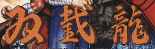
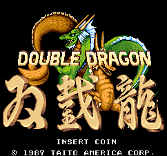
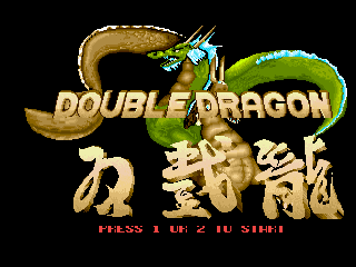
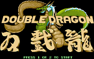
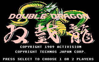
Straight from the game center, lettering from the original flyer and the coin-operated version's title screen. On the flyer, the letters are clear and have a definite chunkiness -- slight corners are added to curves for purely stylistic reasons. On-screen, the chunkiness is subdued, and the 截 is written more sensibly.
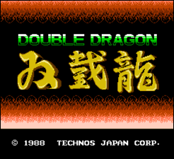
The success of the Nintendo Famicom port was so certain that the porting team didn't even bother with the dragons, and their Chinese characters are noticeably less energetic. Plus, the 龍 is askew. Even the flickering flame effect isn't enough to compensate for the overall blah here.
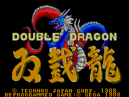
On the Sega Master System, the Chinese characters have a confident, voluptuous heft while the English text loiters oafishly above them. The dragons have also been dyed to match the player characters, making the symbolism so glaring that it is probably visible from space, a viable alternative to the Fibonacci sequence for establishing communication with extraterrestrial civilizations.
Ah, the Amiga port. What an embarrassment. The 3D effects, wonky sizing and criminally negligent kerning make you long for the visual sophistication of WordArt. Worse, the artist seems to have gotten the mistaken impression that the third stroke of the 立 in 龍 was supposed to overlap the fourth. And the right side of the character has developed an extra joint.
The Atari ST, DOS and Amstrad versions, which apparently shared artwork, have the same overlap and extra-knee errors, but their layout is far superior. If only that intern had remembered to fill the holes in the "D" and the "O".
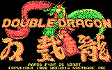
On the Atari 7800, the cursive style is energetic and distinctive, but I advise against looking directly at any point where dragon intersects character unless you have a pane of smoked glass handy.
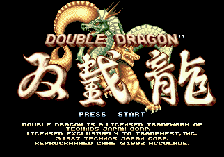
The Chinese characters on the Genesis title screen appear to have been written on cakes by three different jolly chefs. They don't gel as a unit, and the 截 is in the unsettling flyer style again. At least the 3D effect on the English words was executed competently.
The Game Boy port has the fewest colors but the most pleasing and readable title screen of all, for my money. Later, GBA owners enjoyed the astonishing "advance" of using an actual font for the Roman characters.
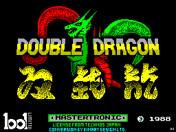
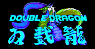
Simplification pushing the bounds of legibility for the ZX Spectrum port, with a color scheme that burns (not unpleasantly). They could have switched to a more streamlined cursive style instead of just omitting strokes, but I suppose that wouldn't have looked as tough.
Meanwhile, in the Hall of Shame, the C64 and MSX versions don't even use the Chinese characters, and the Atari 2600 port ...
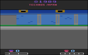
... doesn't give the title at all.
Honorable mention: Street Hero for the Game King.

Previously: Why the bad guys in River City Ransom say "BARF!"


John:
Great post. That your others readers have not commented on it reflects very badly upon them... :P