![[No-sword]](http://no-sword.jp/images/site/no-sword_banner.jpg)
Advice for new women
Some allegorical illustrations by YAGURUMA Ryō from ŌSHIMA Shūichi's 1950 新しい婦人の處世讀本 ("Life skills reader for new women"). "New" means "post-war" here, rather than "post-op". We know this because the very first sentence of the introduction refers to the "new road" that "suddenly opened" for Japan "five years ago now" (what's that, Shūichi? did something happen in 1945?), and the last chapter of the book is all about how vitally important it is for women to vote. But in between, there's the standard mixture of sound advice (don't marry playboys) and, uh, authentic period atmosphere (get up before your husband does and put some make-up on for him).
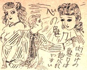
This man is so irresistibly drawn to the Kannon-like floating head's Allure of the Heart that he doesn't even notice the 1920s French hooker on the left there, representing the Allure of the Flesh.
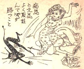
It is a wife's responsibility to keep her husband healthy and free of unitard-clad illness. With judo, if necessary.
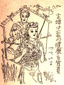
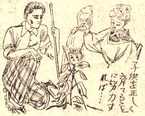
In fact, a wife carries the health of her entire household on her back. I love the extreme realism of this image, right down to the strap holding the baby in place.
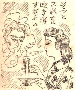
Widows who remarry should learn to blow out the memory of their first husband like a candle. No, really. Look at how sad yet accepting the ex-husband's face is. (This also serves as a meta-allegory for how to deal with the Events that led to the opening up Ōshima's New Road five years ago, of course...)

A woman's caress even has the power to heal a man's suffering heart. Or crush him like a bug.
There are no words.
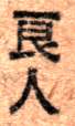
This book is also notable for its use of a bold font which makes subtle changes to certain characters, most noticeably turning the little verticalish comma-like stroke at the top of 良, 新, etc. into a disconnected horizontal line:


Charles:
I'd be interesting in seeing a little more of the text. Judging just from the illustrations, this magazine appears to be printed on a toshaban, a type of mimeograph that was commonly used to print small-run publications in the postwar era. So every single character was probably inscribed by hand. Some of the idiosyncrasies of the font may be due to the difficulty of scratching legible characters in the stencil, which made fine details difficult to produce.There used to be an fascinating website about the toshaban but alas, it has been taken down. Some of it still lives on (minus the best photographs and videos) via the Internet Wayback machine:
http://web.archive.org/web/20001017001259/www.honco.net/japanese/02/page4 html